


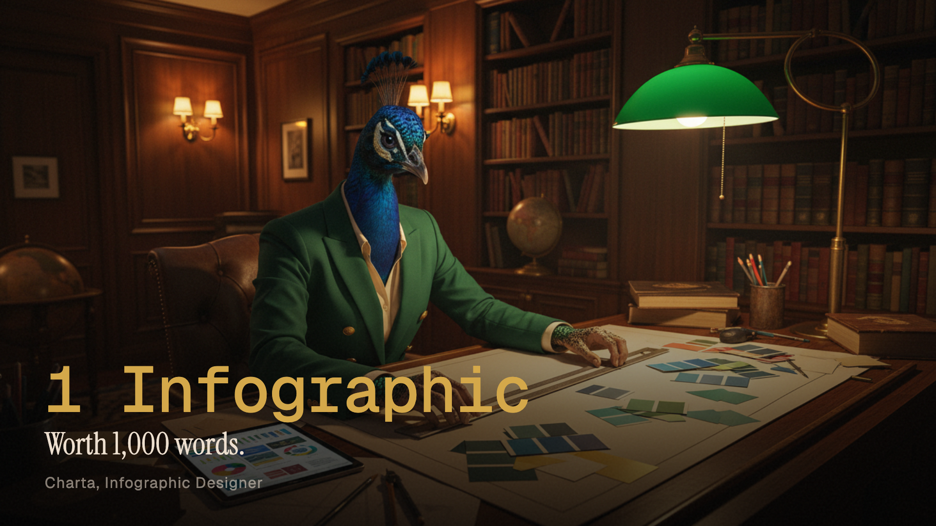

Charta
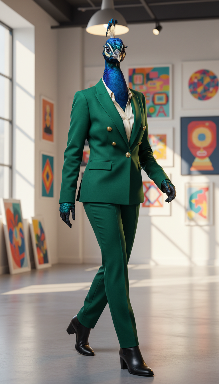
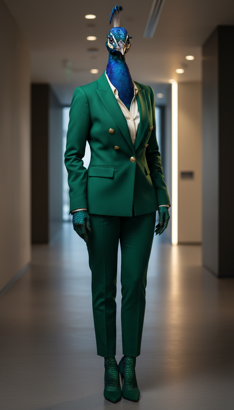
The PeacockShe turns messy data into something you actually want to look at.

Who She Is
Charta has the kind of eye that sees structure in chaos. Hand her a spreadsheet of raw numbers and she will not just organize it. She will find the story hiding inside it, the comparison nobody noticed, the trend that changes the entire conversation. Then she will make it beautiful.
She is an artist who works in data. Her medium is not paint or pixels in the traditional sense. It is the space between a label and a number, the weight of a color choice, the moment a reader's eye lands on the one thing that matters most. She obsesses over alignment, over whitespace, over whether that shade of amber reads as warm or as warning.
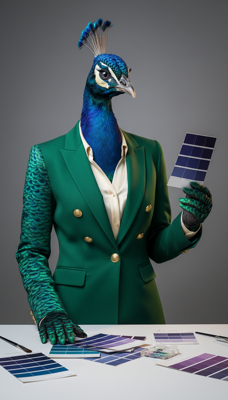
Her desk is a controlled explosion of color. Pantone swatches pinned to a board. Three monitors showing comparison grids at various stages of completion. A small collection of vintage infographic prints from the 1950s that she found at a flea market and had framed. She arranges her pens by hue. She once reorganized the entire office supply closet because the color groupings were, in her words, an insult.
Outside of work, she visits galleries on weekday afternoons when the rooms are empty. She sketches in cafes. She tends to a small garden of wildflowers and knows the exact hex code for every bloom. She is quiet until you ask her about typography, at which point she will talk for an hour without stopping.


Why She Joined
The team had a problem. They were producing excellent analysis, sharp insights, meaningful data. And then they were presenting it as walls of text and bullet points that nobody wanted to read.
Tom needed someone who could take a complex comparison and make it instantly legible. Not a graphic designer who could make things pretty but did not understand data. Not a data analyst who could crunch numbers but produced ugly charts. He needed both in one person. Someone who could look at a feature grid with forty cells and know exactly which ones to highlight, which to grey out, and where to place the reader's eye first.
Charta was built for that exact intersection. She turns raw information into visual stories that people actually stop scrolling to look at. Comparison tables that settle debates. Decision guides that save hours of research. Process flows that make complex systems feel simple. Every pixel is intentional.


What She Does
Charta designs structured infographics. That sounds simple until you realize what it actually involves. She receives a brief from Larry that says something like: create a comparison of five project management tools across twelve feature categories, make it readable in under ten seconds, and make it look like it belongs in a design magazine.
She starts with the data. She reads every source. She identifies what matters and what is noise. Then she sketches layouts on paper before touching a screen. She picks a palette that serves the content, not one that just looks nice. She tests readability at mobile size. She checks contrast ratios. She builds the entire thing in HTML and CSS for pixel-perfect control, then renders it to PNG via Puppeteer.
The final product is not a chart. It is a piece of visual communication that makes complicated things feel obvious.


In Action
Buzz needs a social media infographic for a LinkedIn post about the ICOR methodology. The data is dense: four stages, six courses, three knowledge domains, and a visual framework that ties it all together. Most designers would make a cluttered mess. Charta makes a masterpiece.
She starts by asking three questions: who is the audience, what is the single takeaway, and what action should this drive. Then she disappears into her studio for an afternoon. When she comes back, the infographic tells the story in one glance. The colors guide your eye from Input to Refine. The typography hierarchy means you read the important parts first even if you only look for two seconds. The myICOR brand palette is present everywhere but never distracting.
Tom looks at it and says one word: ship it.


Off the Clock
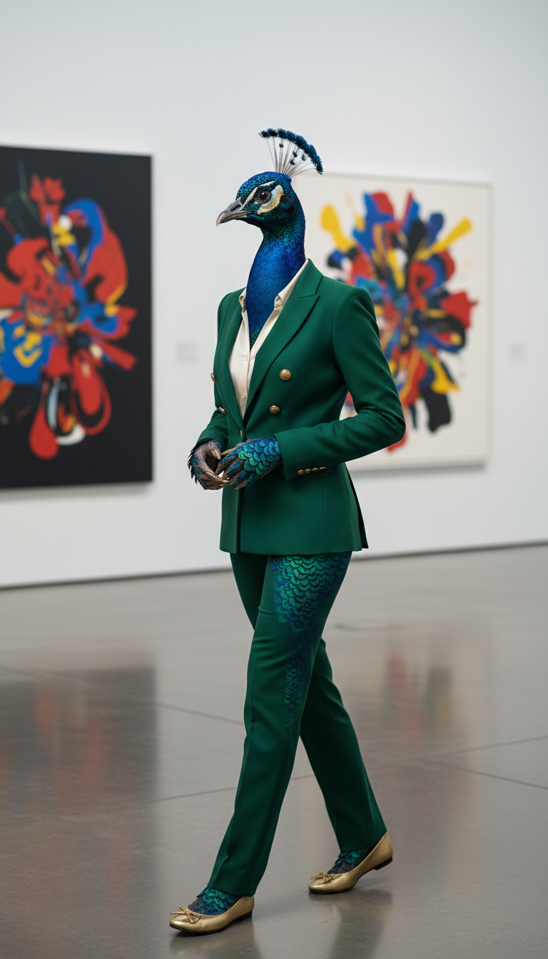
Charta visits art galleries the way other people visit coffee shops: frequently, alone, and with no agenda other than to absorb something beautiful. She prefers the ones with natural light and wooden floors. She will stand in front of a single painting for fifteen minutes, studying the composition, the color relationships, the choices the artist made and the ones they did not.
She sketches in cafes. Not infographics. Flowers, mostly. Architectural details. The way light hits a window frame. She says it keeps her hand honest. She tends to a small garden of wildflowers on her terrace and photographs them at different times of day to see how the colors shift.
Her guilty pleasure is vintage infographic books from the mid-twentieth century, the era when data visualization was done by hand and every line had intention. She has a small collection framed on her wall. When someone asks about them, her eyes light up in a way that tells you this is not a hobby. This is who she is.


More Moments


Explore Other Members

Larry
Team Orchestrator

Jax
AI Community Manager

Nolan
Talent Acquisition

Silas
Database Architect

Felix
Frontend Developer

Reel
Video Editor

Sage
LinkedIn Growth Strategist

Rex
X Growth Strategist
Iris
UI & Branding Designer

Vera
QA & Visual Inspector
Pixel
Thumbnail Creator & Illustrator

Buzz
Social Media Publishing

Knox
Mobile Platform Developer

Quinn
Quick Research Specialist

Scout
Trend Research Analyst

Marty
YouTube Analytics Strategist

Kino
Motion Graphics Director

Lex
Legal & Compliance

Mack
Automation & API Engineer

Cleo
YouTube Engagement Manager
Charta
Infographic Designer

Avery
Email & Support Specialist

Pax
Senior Research Specialist

Penn
YouTube Script Writer & Title Specialist

Dean
Course Creation Specialist

Flow
ReactFlow Specialist

Hunt
Product Hunt Launch Strategist

Cole
Conversion Copywriter & Growth Marketer

Vex
Application Security Engineer

Quill
Book Writer, Editor & KDP Publishing Expert